Penerapan Tema Material - Membuat Aplikasi Woof
Pada pertemuan minggu ke-9 perkuliahan mata kuliah Pemrograman Perangkat Bergerak, kami membahas tentang Penerapan Tema Material dalam pengembangan aplikasi perangkat lunak berbasis Android. Sebagai tugas latihan, kami diminta membuat aplikasi Woof. Aplikasi ini akan menampilkan daftar anjing dan menggunakan tema Material untuk membuat pengalaman aplikasi yang menarik.
Untuk membuat aplikasi Woof, langkah pertama yang dilakukan adalah mendownload proyek awal dari GitHub, kemudian mengekstraknya dari zip. Setelah itu, buka proyek tersebut di Android Studio dan jalankan aplikasi. Berikut tampilan awal aplikasi pada menu preview sebelum diterapkan tema Material:
Langkah selanjutnya adalah menyiapkan warna, bentuk, dan tipografi yang akan digunakan pada tema Material. Untuk menghasilkan palet warna, dapat menggunakan bantuan Material Theme Builder dengan memasukkan warna dasar #006C4C sebagai Primary Color. Ini akan menghasilkan palet warna sebagai berikut:
- Terdapat 2 palet warna yang dihasilkan, yaitu untuk tema terang dan gelap.
- Warna primer digunakan untuk komponen utama di seluruh UI.
- Warna sekunder digunakan untuk komponen yang bukan utama di UI.
- Warna tersier digunakan untuk aksen kontras yang dapat digunakan untuk menyeimbangkan warna primer dan sekunder atau membawa perhatian tinggi pada elemen, seperti kolom input.
- Elemen warna on muncul di atas warna lain pada palet, dan terutama diterapkan pada teks, ikonografi, dan goresan. Pada palet warna, terdapat warna onSurface, yang muncul di atas warna platform, dan warna onPrimary, yang muncul di atas warna primer.
Untuk bentuk yang akan digunakan pada komponen di Compose, ada dua jenis, yaitu small untuk mengubah komponen gambar menjadi bentuk lingkaran, dan medium untuk membentuk komponen item daftar menjadi sebuah Card. Kemudian untuk tipografi, akan digunakan tiga font khusus: Abril Fatface, Montserrat Bold, dan Montserrat Regular. Font-font tersebut dapat diunduh dari Google Fonts dan diimpor ke dalam direktori res/font. Di bawah ini adalah tabel yang menampilkan jenis font, ketebalan, dan ukuran dari setiap judul utama yang akan ditambahkan.
- displayLarge digunakan sebagai gaya untuk nama aplikasi pada Top App Bar.
- displayMedium digunakan sebagai gaya untuk dogName karena merupakan informasi singkat yang penting.
- bodyLarge sebagai gaya untuk dogAge karena berfungsi cukup baik dengan ukuran teks yang lebih kecil.
Warna, bentuk, dan tipografi yang telah disiapkan kemudian diinisialisasi masing-masing pada Color.kt, Shape.kt, dan Type.kt. Kemudian ketiganya diterapkan pada Theme.kt. Berikut ini adalah hasil kode yang dihasilkan:
/* | |
* Copyright (C) 2023 The Android Open Source Project | |
* | |
* Licensed under the Apache License, Version 2.0 (the "License"); | |
* you may not use this file except in compliance with the License. | |
* You may obtain a copy of the License at | |
* | |
* https://www.apache.org/licenses/LICENSE-2.0 | |
* | |
* Unless required by applicable law or agreed to in writing, software | |
* distributed under the License is distributed on an "AS IS" BASIS, | |
* WITHOUT WARRANTIES OR CONDITIONS OF ANY KIND, either express or implied. | |
* See the License for the specific language governing permissions and | |
* limitations under the License. | |
*/ | |
package com.example.woof.ui.theme | |
import androidx.compose.ui.graphics.Color | |
val md_theme_light_primary = Color(0xFF006C4C) | |
val md_theme_light_onPrimary = Color(0xFFFFFFFF) | |
val md_theme_light_primaryContainer = Color(0xFF89F8C7) | |
val md_theme_light_onPrimaryContainer = Color(0xFF002114) | |
val md_theme_light_secondary = Color(0xFF4D6357) | |
val md_theme_light_onSecondary = Color(0xFFFFFFFF) | |
val md_theme_light_secondaryContainer = Color(0xFFCFE9D9) | |
val md_theme_light_onSecondaryContainer = Color(0xFF092016) | |
val md_theme_light_tertiary = Color(0xFF3D6373) | |
val md_theme_light_onTertiary = Color(0xFFFFFFFF) | |
val md_theme_light_tertiaryContainer = Color(0xFFC1E8FB) | |
val md_theme_light_onTertiaryContainer = Color(0xFF001F29) | |
val md_theme_light_error = Color(0xFFBA1A1A) | |
val md_theme_light_errorContainer = Color(0xFFFFDAD6) | |
val md_theme_light_onError = Color(0xFFFFFFFF) | |
val md_theme_light_onErrorContainer = Color(0xFF410002) | |
val md_theme_light_background = Color(0xFFFBFDF9) | |
val md_theme_light_onBackground = Color(0xFF191C1A) | |
val md_theme_light_surface = Color(0xFFFBFDF9) | |
val md_theme_light_onSurface = Color(0xFF191C1A) | |
val md_theme_light_surfaceVariant = Color(0xFFDBE5DD) | |
val md_theme_light_onSurfaceVariant = Color(0xFF404943) | |
val md_theme_light_outline = Color(0xFF707973) | |
val md_theme_light_inverseOnSurface = Color(0xFFEFF1ED) | |
val md_theme_light_inverseSurface = Color(0xFF2E312F) | |
val md_theme_light_inversePrimary = Color(0xFF6CDBAC) | |
val md_theme_light_shadow = Color(0xFF000000) | |
val md_theme_light_surfaceTint = Color(0xFF006C4C) | |
val md_theme_light_outlineVariant = Color(0xFFBFC9C2) | |
val md_theme_light_scrim = Color(0xFF000000) | |
val md_theme_dark_primary = Color(0xFF6CDBAC) | |
val md_theme_dark_onPrimary = Color(0xFF003826) | |
val md_theme_dark_primaryContainer = Color(0xFF005138) | |
val md_theme_dark_onPrimaryContainer = Color(0xFF89F8C7) | |
val md_theme_dark_secondary = Color(0xFFB3CCBE) | |
val md_theme_dark_onSecondary = Color(0xFF1F352A) | |
val md_theme_dark_secondaryContainer = Color(0xFF354B40) | |
val md_theme_dark_onSecondaryContainer = Color(0xFFCFE9D9) | |
val md_theme_dark_tertiary = Color(0xFFA5CCDF) | |
val md_theme_dark_onTertiary = Color(0xFF073543) | |
val md_theme_dark_tertiaryContainer = Color(0xFF244C5B) | |
val md_theme_dark_onTertiaryContainer = Color(0xFFC1E8FB) | |
val md_theme_dark_error = Color(0xFFFFB4AB) | |
val md_theme_dark_errorContainer = Color(0xFF93000A) | |
val md_theme_dark_onError = Color(0xFF690005) | |
val md_theme_dark_onErrorContainer = Color(0xFFFFDAD6) | |
val md_theme_dark_background = Color(0xFF191C1A) | |
val md_theme_dark_onBackground = Color(0xFFE1E3DF) | |
val md_theme_dark_surface = Color(0xFF191C1A) | |
val md_theme_dark_onSurface = Color(0xFFE1E3DF) | |
val md_theme_dark_surfaceVariant = Color(0xFF404943) | |
val md_theme_dark_onSurfaceVariant = Color(0xFFBFC9C2) | |
val md_theme_dark_outline = Color(0xFF8A938C) | |
val md_theme_dark_inverseOnSurface = Color(0xFF191C1A) | |
val md_theme_dark_inverseSurface = Color(0xFFE1E3DF) | |
val md_theme_dark_inversePrimary = Color(0xFF006C4C) | |
val md_theme_dark_shadow = Color(0xFF000000) | |
val md_theme_dark_surfaceTint = Color(0xFF6CDBAC) | |
val md_theme_dark_outlineVariant = Color(0xFF404943) | |
val md_theme_dark_scrim = Color(0xFF000000) |
/* | |
* Copyright (C) 2023 The Android Open Source Project | |
* | |
* Licensed under the Apache License, Version 2.0 (the "License"); | |
* you may not use this file except in compliance with the License. | |
* You may obtain a copy of the License at | |
* | |
* https://www.apache.org/licenses/LICENSE-2.0 | |
* | |
* Unless required by applicable law or agreed to in writing, software | |
* distributed under the License is distributed on an "AS IS" BASIS, | |
* WITHOUT WARRANTIES OR CONDITIONS OF ANY KIND, either express or implied. | |
* See the License for the specific language governing permissions and | |
* limitations under the License. | |
*/ | |
package com.example.woof.ui.theme | |
import androidx.compose.foundation.shape.RoundedCornerShape | |
import androidx.compose.material3.Shapes | |
import androidx.compose.ui.unit.dp | |
val Shapes = Shapes( | |
small = RoundedCornerShape(50.dp), | |
medium = RoundedCornerShape(bottomStart = 16.dp, topEnd = 16.dp) | |
) |
/* | |
* Copyright (C) 2023 The Android Open Source Project | |
* | |
* Licensed under the Apache License, Version 2.0 (the "License"); | |
* you may not use this file except in compliance with the License. | |
* You may obtain a copy of the License at | |
* | |
* https://www.apache.org/licenses/LICENSE-2.0 | |
* | |
* Unless required by applicable law or agreed to in writing, software | |
* distributed under the License is distributed on an "AS IS" BASIS, | |
* WITHOUT WARRANTIES OR CONDITIONS OF ANY KIND, either express or implied. | |
* See the License for the specific language governing permissions and | |
* limitations under the License. | |
*/ | |
package com.example.woof.ui.theme | |
import android.app.Activity | |
import android.os.Build | |
import android.view.View | |
import androidx.compose.foundation.isSystemInDarkTheme | |
import androidx.compose.material3.MaterialTheme | |
import androidx.compose.material3.darkColorScheme | |
import androidx.compose.material3.dynamicDarkColorScheme | |
import androidx.compose.material3.dynamicLightColorScheme | |
import androidx.compose.material3.lightColorScheme | |
import androidx.compose.runtime.Composable | |
import androidx.compose.runtime.SideEffect | |
import androidx.compose.ui.graphics.Color | |
import androidx.compose.ui.graphics.toArgb | |
import androidx.compose.ui.platform.LocalContext | |
import androidx.compose.ui.platform.LocalView | |
import androidx.core.view.WindowCompat | |
private val DarkColorScheme = darkColorScheme( | |
primary = md_theme_dark_primary, | |
onPrimary = md_theme_dark_onPrimary, | |
primaryContainer = md_theme_dark_primaryContainer, | |
onPrimaryContainer = md_theme_dark_onPrimaryContainer, | |
secondary = md_theme_dark_secondary, | |
onSecondary = md_theme_dark_onSecondary, | |
secondaryContainer = md_theme_dark_secondaryContainer, | |
onSecondaryContainer = md_theme_dark_onSecondaryContainer, | |
tertiary = md_theme_dark_tertiary, | |
onTertiary = md_theme_dark_onTertiary, | |
tertiaryContainer = md_theme_dark_tertiaryContainer, | |
onTertiaryContainer = md_theme_dark_onTertiaryContainer, | |
error = md_theme_dark_error, | |
errorContainer = md_theme_dark_errorContainer, | |
onError = md_theme_dark_onError, | |
onErrorContainer = md_theme_dark_onErrorContainer, | |
background = md_theme_dark_background, | |
onBackground = md_theme_dark_onBackground, | |
surface = md_theme_dark_surface, | |
onSurface = md_theme_dark_onSurface, | |
surfaceVariant = md_theme_dark_surfaceVariant, | |
onSurfaceVariant = md_theme_dark_onSurfaceVariant, | |
outline = md_theme_dark_outline, | |
inverseOnSurface = md_theme_dark_inverseOnSurface, | |
inverseSurface = md_theme_dark_inverseSurface, | |
inversePrimary = md_theme_dark_inversePrimary, | |
surfaceTint = md_theme_dark_surfaceTint, | |
outlineVariant = md_theme_dark_outlineVariant, | |
scrim = md_theme_dark_scrim, | |
) | |
private val LightColorScheme = lightColorScheme( | |
primary = md_theme_light_primary, | |
onPrimary = md_theme_light_onPrimary, | |
primaryContainer = md_theme_light_primaryContainer, | |
onPrimaryContainer = md_theme_light_onPrimaryContainer, | |
secondary = md_theme_light_secondary, | |
onSecondary = md_theme_light_onSecondary, | |
secondaryContainer = md_theme_light_secondaryContainer, | |
onSecondaryContainer = md_theme_light_onSecondaryContainer, | |
tertiary = md_theme_light_tertiary, | |
onTertiary = md_theme_light_onTertiary, | |
tertiaryContainer = md_theme_light_tertiaryContainer, | |
onTertiaryContainer = md_theme_light_onTertiaryContainer, | |
error = md_theme_light_error, | |
errorContainer = md_theme_light_errorContainer, | |
onError = md_theme_light_onError, | |
onErrorContainer = md_theme_light_onErrorContainer, | |
background = md_theme_light_background, | |
onBackground = md_theme_light_onBackground, | |
surface = md_theme_light_surface, | |
onSurface = md_theme_light_onSurface, | |
surfaceVariant = md_theme_light_surfaceVariant, | |
onSurfaceVariant = md_theme_light_onSurfaceVariant, | |
outline = md_theme_light_outline, | |
inverseOnSurface = md_theme_light_inverseOnSurface, | |
inverseSurface = md_theme_light_inverseSurface, | |
inversePrimary = md_theme_light_inversePrimary, | |
surfaceTint = md_theme_light_surfaceTint, | |
outlineVariant = md_theme_light_outlineVariant, | |
scrim = md_theme_light_scrim, | |
) | |
@Composable | |
fun WoofTheme( | |
darkTheme: Boolean = isSystemInDarkTheme(), | |
// Dynamic color is available on Android 12+ | |
dynamicColor: Boolean = true, | |
content: @Composable () -> Unit | |
) { | |
val colorScheme = when { | |
dynamicColor && Build.VERSION.SDK_INT >= Build.VERSION_CODES.S -> { | |
val context = LocalContext.current | |
if (darkTheme) dynamicDarkColorScheme(context) else dynamicLightColorScheme(context) | |
} | |
darkTheme -> DarkColorScheme | |
else -> LightColorScheme | |
} | |
val view = LocalView.current | |
if (!view.isInEditMode) { | |
SideEffect { | |
val window = (view.context as Activity).window | |
window.statusBarColor = colorScheme.primary.toArgb() | |
WindowCompat.getInsetsController(window, view).isAppearanceLightStatusBars = darkTheme | |
} | |
} | |
MaterialTheme( | |
colorScheme = colorScheme, | |
typography = Typography, | |
shapes = Shapes, | |
content = content | |
) | |
} | |
/** | |
* Sets up edge-to-edge for the window of this [view]. The system icon colors are set to either | |
* light or dark depending on whether the [darkTheme] is enabled or not. | |
*/ | |
private fun setUpEdgeToEdge(view: View, darkTheme: Boolean) { | |
val window = (view.context as Activity).window | |
WindowCompat.setDecorFitsSystemWindows(window, false) | |
window.statusBarColor = Color.Transparent.toArgb() | |
val navigationBarColor = when { | |
Build.VERSION.SDK_INT >= 29 -> Color.Transparent.toArgb() | |
Build.VERSION.SDK_INT >= 26 -> Color(0xFF, 0xFF, 0xFF, 0x63).toArgb() | |
// Min sdk version for this app is 24, this block is for SDK versions 24 and 25 | |
else -> Color(0x00, 0x00, 0x00, 0x50).toArgb() | |
} | |
window.navigationBarColor = navigationBarColor | |
val controller = WindowCompat.getInsetsController(window, view) | |
controller.isAppearanceLightStatusBars = !darkTheme | |
controller.isAppearanceLightNavigationBars = !darkTheme | |
} |
/* | |
* Copyright (C) 2023 The Android Open Source Project | |
* | |
* Licensed under the Apache License, Version 2.0 (the "License"); | |
* you may not use this file except in compliance with the License. | |
* You may obtain a copy of the License at | |
* | |
* https://www.apache.org/licenses/LICENSE-2.0 | |
* | |
* Unless required by applicable law or agreed to in writing, software | |
* distributed under the License is distributed on an "AS IS" BASIS, | |
* WITHOUT WARRANTIES OR CONDITIONS OF ANY KIND, either express or implied. | |
* See the License for the specific language governing permissions and | |
* limitations under the License. | |
*/ | |
package com.example.woof.ui.theme | |
import androidx.compose.material3.Typography | |
import androidx.compose.ui.text.TextStyle | |
import androidx.compose.ui.text.font.Font | |
import androidx.compose.ui.text.font.FontFamily | |
import androidx.compose.ui.text.font.FontWeight | |
import androidx.compose.ui.unit.sp | |
import com.example.woof.R | |
val Typography: Typography | |
get() = Typography( | |
displayLarge = TextStyle( | |
fontFamily = AbrilFatface, | |
fontWeight = FontWeight.Normal, | |
fontSize = 36.sp | |
), | |
displayMedium = TextStyle( | |
fontFamily = Montserrat, | |
fontWeight = FontWeight.Bold, | |
fontSize = 20.sp | |
), | |
labelSmall = TextStyle( | |
fontFamily = Montserrat, | |
fontWeight = FontWeight.Bold, | |
fontSize = 14.sp | |
), | |
bodyLarge = TextStyle( | |
fontFamily = Montserrat, | |
fontWeight = FontWeight.Normal, | |
fontSize = 14.sp | |
) | |
) | |
val AbrilFatface = FontFamily( | |
Font(R.font.abril_fatface_regular) | |
) | |
val Montserrat = FontFamily( | |
Font(R.font.montserrat_regular), | |
Font(R.font.montserrat_bold) | |
) |
- DarkColorScheme dan LightColorScheme adalah dua objek yang mewakili skema warna untuk tema gelap dan terang dalam aplikasi. Masing-masing objek ini mengatur warna untuk berbagai elemen UI seperti primer, sekunder, dan latar belakang, serta memberikan aksen dan kontras yang sesuai.
- WoofTheme adalah fungsi Composable yang digunakan untuk menerapkan tema visual ke seluruh aplikasi. Fungsi ini mengambil parameter seperti darkTheme untuk menentukan apakah tema yang akan diterapkan adalah tema gelap atau terang, dan dynamicColor untuk menentukan apakah warna tema dapat berubah secara dinamis. Di dalamnya, WoofTheme menggunakan MaterialTheme untuk menerapkan skema warna, tipografi, dan bentuk yang telah disiapkan sebelumnya.
Setelah menyiapkan hal-hal yang diperlukan untuk tema Material, langkah berikutnya adalah menerapkan tema tersebut pada komponen Composable aplikasi. Ini dapat dilakukan dengan memodifikasi file MainActivity.kt sebagai berikut:
/* | |
* Copyright (C) 2023 The Android Open Source Project | |
* | |
* Licensed under the Apache License, Version 2.0 (the "License"); | |
* you may not use this file except in compliance with the License. | |
* You may obtain a copy of the License at | |
* | |
* https://www.apache.org/licenses/LICENSE-2.0 | |
* | |
* Unless required by applicable law or agreed to in writing, software | |
* distributed under the License is distributed on an "AS IS" BASIS, | |
* WITHOUT WARRANTIES OR CONDITIONS OF ANY KIND, either express or implied. | |
* See the License for the specific language governing permissions and | |
* limitations under the License. | |
*/ | |
package com.example.woof | |
import android.os.Bundle | |
import androidx.activity.ComponentActivity | |
import androidx.activity.compose.setContent | |
import androidx.annotation.DrawableRes | |
import androidx.annotation.StringRes | |
import androidx.compose.foundation.Image | |
import androidx.compose.foundation.layout.Column | |
import androidx.compose.foundation.layout.Row | |
import androidx.compose.foundation.layout.fillMaxSize | |
import androidx.compose.foundation.layout.fillMaxWidth | |
import androidx.compose.foundation.layout.padding | |
import androidx.compose.foundation.layout.size | |
import androidx.compose.foundation.lazy.LazyColumn | |
import androidx.compose.foundation.lazy.items | |
import androidx.compose.material3.Card | |
import androidx.compose.material3.CenterAlignedTopAppBar | |
import androidx.compose.material3.ExperimentalMaterial3Api | |
import androidx.compose.material3.MaterialTheme | |
import androidx.compose.material3.Scaffold | |
import androidx.compose.material3.Surface | |
import androidx.compose.material3.Text | |
import androidx.compose.runtime.Composable | |
import androidx.compose.ui.Alignment | |
import androidx.compose.ui.Modifier | |
import androidx.compose.ui.draw.clip | |
import androidx.compose.ui.layout.ContentScale | |
import androidx.compose.ui.res.dimensionResource | |
import androidx.compose.ui.res.painterResource | |
import androidx.compose.ui.res.stringResource | |
import androidx.compose.ui.tooling.preview.Preview | |
import com.example.woof.data.Dog | |
import com.example.woof.data.dogs | |
import com.example.woof.ui.theme.WoofTheme | |
class MainActivity : ComponentActivity() { | |
override fun onCreate(savedInstanceState: Bundle?) { | |
super.onCreate(savedInstanceState) | |
setContent { | |
WoofTheme { | |
// A surface container using the 'background' color from the theme | |
Surface( | |
modifier = Modifier.fillMaxSize() | |
) { | |
WoofApp() | |
} | |
} | |
} | |
} | |
} | |
/** | |
* Composable that displays an app bar and a list of dogs. | |
*/ | |
@Composable | |
fun WoofApp() { | |
Scaffold( | |
topBar = { | |
WoofTopAppBar() | |
} | |
) { it -> | |
LazyColumn(contentPadding = it) { | |
items(dogs) { | |
DogItem( | |
dog = it, | |
modifier = Modifier.padding(dimensionResource(R.dimen.padding_small)) | |
) | |
} | |
} | |
} | |
} | |
/** | |
* Composable that displays application name in Top App Bar. | |
* | |
* @param modifier modifiers to set to this composable | |
*/ | |
@OptIn(ExperimentalMaterial3Api::class) | |
@Composable | |
fun WoofTopAppBar( | |
modifier: Modifier = Modifier | |
) { | |
CenterAlignedTopAppBar( | |
title = { | |
Row( | |
verticalAlignment = Alignment.CenterVertically | |
) { | |
Image( | |
modifier = Modifier | |
.size(dimensionResource(id = R.dimen.image_size)) | |
.padding(dimensionResource(id = R.dimen.padding_small)), | |
painter = painterResource(R.drawable.ic_woof_logo), | |
contentDescription = null | |
) | |
Text( | |
text = stringResource(R.string.app_name), | |
style = MaterialTheme.typography.displayLarge | |
) | |
} | |
}, | |
modifier = modifier | |
) | |
} | |
/** | |
* Composable that displays a list item containing a dog icon and their information. | |
* | |
* @param dog contains the data that populates the list item | |
* @param modifier modifiers to set to this composable | |
*/ | |
@Composable | |
fun DogItem( | |
dog: Dog, | |
modifier: Modifier = Modifier | |
) { | |
Card( | |
modifier = modifier | |
) { | |
Row( | |
modifier = modifier | |
.fillMaxWidth() | |
.padding(dimensionResource(R.dimen.padding_small)) | |
) { | |
DogIcon(dog.imageResourceId) | |
DogInformation(dog.name, dog.age) | |
} | |
} | |
} | |
/** | |
* Composable that displays a photo of a dog. | |
* | |
* @param dogIcon is the resource ID for the image of the dog | |
* @param modifier modifiers to set to this composable | |
*/ | |
@Composable | |
fun DogIcon( | |
@DrawableRes dogIcon: Int, | |
modifier: Modifier = Modifier | |
) { | |
Image( | |
modifier = modifier | |
.size(dimensionResource(R.dimen.image_size)) | |
.padding(dimensionResource(R.dimen.padding_small)) | |
.clip(MaterialTheme.shapes.small), | |
contentScale = ContentScale.Crop, | |
painter = painterResource(dogIcon), | |
// Content Description is not needed here - image is decorative, and setting a null content | |
// description allows accessibility services to skip this element during navigation. | |
contentDescription = null | |
) | |
} | |
/** | |
* Composable that displays a dog's name and age. | |
* | |
* @param dogName is the resource ID for the string of the dog's name | |
* @param dogAge is the Int that represents the dog's age | |
* @param modifier modifiers to set to this composable | |
*/ | |
@Composable | |
fun DogInformation( | |
@StringRes dogName: Int, | |
dogAge: Int, | |
modifier: Modifier = Modifier | |
) { | |
Column(modifier = modifier) { | |
Text( | |
text = stringResource(dogName), | |
style = MaterialTheme.typography.displayMedium, | |
modifier = Modifier.padding(top = dimensionResource(R.dimen.padding_small)) | |
) | |
Text( | |
text = stringResource(R.string.years_old, dogAge), | |
style = MaterialTheme.typography.bodyLarge | |
) | |
} | |
} | |
/** | |
* Composable that displays what the UI of the app looks like in light theme in the design tab. | |
*/ | |
@Preview(showBackground = true) | |
@Composable | |
fun WoofPreview() { | |
WoofTheme(darkTheme = false) { | |
WoofApp() | |
} | |
} |
- WoofApp adalah komponen utama aplikasi yang menggunakan Scaffold sebagai kerangka layar dengan WoofTopAppBar sebagai bagian atasnya. Di dalam Scaffold, terdapat LazyColumn yang menampilkan daftar anjing dari data dogs, dan setiap item daftar diwakili oleh DogItem.
- WoofTopAppBar adalah komponen yang menampilkan nama aplikasi dan logo di bagian atas layar menggunakan CenterAlignedTopAppBar.
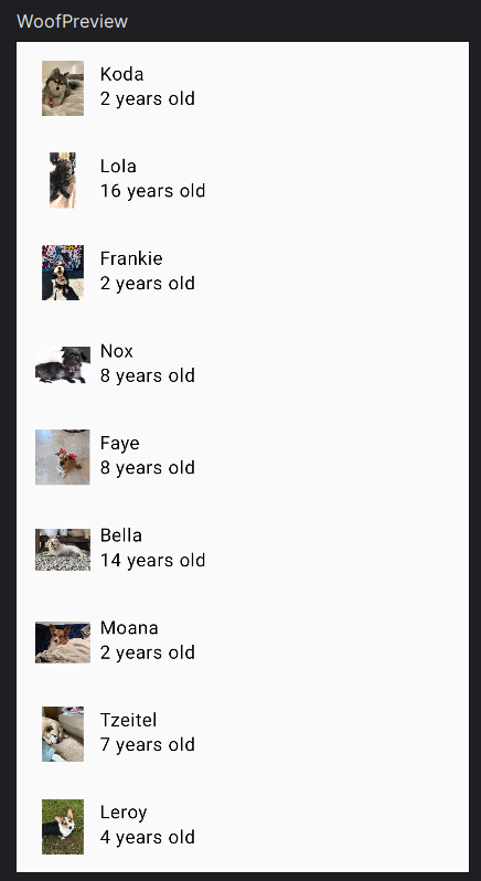
- DogItem adalah komponen yang menampilkan item daftar untuk setiap anjing, berisi gambar anjing dan informasinya menggunakan Card, DogIcon untuk menampilkan gambar anjing, dan DogInformation untuk menampilkan nama dan usia anjing.
- Kode tersebut juga menyediakan fungsi WoofPreview yang menampilkan tampilan aplikasi untuk pratinjau tampilan UI dalam mode desain.
Terakhir, kita dapat menjalankan aplikasi. Berikut adalah tampilan akhir aplikasi Woof dalam mode terang, gelap, dan dynamic color pada menu preview:
Dan berikut adalah tampilan aplikasi pada perangkat Android:
Komentar
Posting Komentar